It seems like a technology thing, but it isn’t. Of Moodle, Blackboard, and Canvas, only Moodle lets you grade posts, not students.
Bb and Canvas both let you use rubrics/ratings to grade discussions, but both want to grade by student rather than post. Canvas even forces you into one grade per student, regardless of how often they posted.
This is a perfect example of bad pedagogy embedded in the technology. It’s based on the idea of grading students, because students get the grades.
But I don’t grade students — I grade work. In forums for posting primary sources, I rate each source, using qualitative scales — primary source fulfilled, live link needed, full citation needed, etc. These correspond to number grades that go to the Gradebook, but what the student sees is the comment, indicating which corrections they need to make.
And in Moodle I can grade them all with drop downs, because a single, simple forum is all on one page. Super quick.
Bb and Canvas’ insistence on grading per student means several clicks per student, per class, every week, for every source posted. Bad pedagogy, bad workflow.
Perhaps if these LMSs considered that we were grading work rather than students, it wouldn’t be designed like this. When a student asks “did you grade me down?” or “when you grade me, remember I have four classes”, I always point out that I never grade them, only their work.
How did we get to a place where the default is to grade students? Is it our educational culture, associating a person’s work with who they are? Surely that’s a bad idea. When we conflate a person with their work, we imply that their work is not only a product of themselves, it is their self. Every critique become a critique of the self.
We mustn’t embed bad ideas into immutable systems. Really.
Having worked in Canvas for just a little while, its insidious pedagogy is beginning to reveal itself.
Above all, Canvas’ appearance is designed to evoke simplicity, like Google’s Search page. The fonts are large, friendly, sans serif. There is plenty of white space, implying rest, with no need for cognitive agitation or disturbance.
The language for instructions and content regions uses short words at the second-grade level, which is more reassuring than complex instructions. This implies that this will be easy, no need to fear the system.
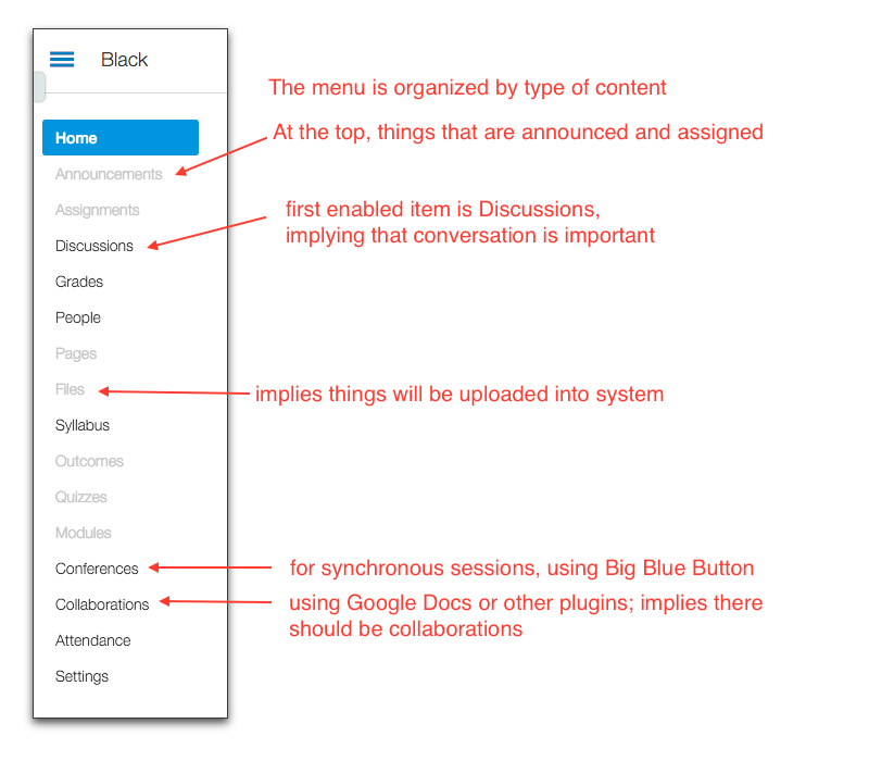
The default left-hand menu, which cannot be moved or removed, makes it clear that certain elements are expected and that they are meant to be organized by type:
This type-centered pedagogy is enforced by design that does not permit any of the menu items to be changed, only disabled. Once on the DL, they never disappear. But neither can they be edited to prevent a long list of disabled mistakes.
You can create new pages or even external URLs as menu items, using the Redirect App, but it takes multiple clicks and multiple saves and is quite tricky (thus my long DL). The implication of so many steps is that doing this should not be standard operating procedure.
Notice that some pages cannot be disabled, only hidden (Discussions, People). This implies it is wrong not to want those items, that you should reconsider.
Getting back to the navigation: if you don’t like the content organized by type, and would prefer an interactive syllabus (like Moodle’s weekly design), you’d use Modules. The Modules page lets you organize all the class items within subheadings. These headings and all the links are bold text, with no provision for adding images (though you can apparently substitute icons if you know what you’re doing). The list of links is in forest green text and is spectacularly ugly, suggesting one wouldn’t want it to be a landing page – wouldn’t it be better to go back and do everything by type instead?
The Quizzes use test banks for creating variety (i.e. 50 questions in the test bank, using 10 randomly on each quiz), but items changed in the banks don’t change in any quizzes that have already been created. Created quizzes are thus intended to be static.
Each question in a quiz must be worth at least one point, and increase in whole numbers only. You cannot take a batch of questions and combine them into a single quiz of, say, 10 points, which might make each question worth .35 points, for example. This implies that quiz questions should be simple, each worth numbers that are easy to add up.
There are few areas where students can take control, and most of these are outside the actual LMS (like in Google Docs). Crocodoc is available for the instructor to annotate student work, but not for students to annotate together. This implies that the instructor is supposed to control all class elements that are inside the system.
Of interactive elements, only Discussions are actually inside the system. The posts are somewhat nested. This implies there should be replies to posts, but the large font size and huge amounts of white space, and the fact that the Discussions page itself is a long list of links, imply that there should be multiple discussions, on different topics or for different times, rather than one large discussion area.
Going outside the system to collaborate and meet synchronously implies these are unusual things to do. They require additional log-ins to places people might not be comfortable with, like Google. There are many “Apps” that can be linked into the class in such a way. Many require not only additional log-ins but additional payments. This implies that such places are special, unusual, perhaps dangerous.
Adding media to a post offers few options. To add media to a post, you may either record a video or audio file right then, or upload a media file. This implies that you should be using some talking head video, or have your video in computer-based files, rather than on the open web.
Confused? Assistance is available. On the top of the first page when you go into your new course is an offer of help setting up. This leads you to a list of steps:
The list implies that you should import content if you can, then add assignments, students, and files. Then decide which items on the menu you want to use. Customize your home page, set up a calendar, add TAs (how lucky are you to have these?), then publish. There is no discussion ofyour objectives or your pedagogy on these helpful steps. Really, you aren’t meant to think about all that, just put all your stuff in the right place so students can find it.
In the 2013 article The Predatory Pedagogy of On-Line Education , anthropologist Brian McKenna uses an investor conference for Instructure (makers of Canvas) to highlight problems with LMSs and online education. This caught my eye:
The stakes are incredibly high. But most faculties across the country seem in the dark. “Pedagogy as an intellectual, moral and political practice is now based on measurements of value derived from market Competition,” argues educational theorist Henry Giroux, “Mathematical utility has now replaced critical dialogue, debate, risk-taking, the power of imaginative leaps and learning for the sake of learning. A crude instrumental rationality now governs the form and content of curricula, and where content has the potential to open up the possibility of critical thinking, it is quickly shut down. This is a pedagogy that has led to the abandonment of democratic impulses, analytic thinking, and social responsibility.
It is not the case the one cannot create constructivist or connectivist pedagogies, or design explorations or learning adventures, in Canvas. I intend to spend much of the next year doing exactly that. But the design of the system does not encourage it. The system strips code entered into its pages, won’t display elements it doesn’t like from outside URLs, and makes embedding tricky and difficult. In the Canvas Community, there are hundreds of requests from faculty and instructional designers to add features that have long existed in other systems. While many of these features are managerial, at least as many concern aspects of opening up the system to greater customization, faculty control, and student leadership.
As I noted years ago in Insidious Pedagogy, LMSs each have their own internal pedagogy, based on the principles of their designers. The teachers who are most likely to be led by the default designs of these systems are instructors who are new to online teaching, or teaching with a pre-made course, or using few online technologies in their own lives outside their classes. More online teachers than ever fall into these categories. Like their students, they will prefer things simple and standardized so they can work more quickly rather than learn more. Thus will the critical pedagogy of faculty, which is so necessary for creating critical thinking in our students, be suppressed.
Many of us being forced to switch over to Canvas are coming up with metaphors, such as my idea of your old LMS being like your old house, and your new LMS like moving to a new house where nothing’s in the right place.
But you can eventually set up your new home the way you like it, so this analogy doesn’t fully work for an LMS. For me, Moodle was like running my own restaurant, with table service. Canvas has reduced me to a drive-thru window. It is difficult to present your meal attractively or in an appetizing way through that window, though I can package it for you conveniently so you can take it with you in a box.
I can now get a little more specific about what I would need in Canvas that isn’t there, just by looking in the Canvas Community for what people want to add. Ideas are submitted, evaluated, and then some are voted on and moved forward.
I have marked the ones I’ve been accustomed to having in Moodle, or very much need in Canvas, with a *.
List of features open for voting in Canvas include:
*Create a student-accessible rubric for self-assessments
Allow two-part quiz questions
*Add subject lines to discussion posts (I have them edit them by putting their thesis there for easy searching)
Tables in Canvas (request for actual WYSIWYG in Rich Text Editor)
Batch question editing in a quiz
Assign peer reviews by student group
*Custom canned comments in SpeedGrader
Context help
*Add, Create or Modify a Calculated or the Total Colum in the Gradebook
Time between quiz attempts
And under consideration: (not likely in six months)
*Allow students to upload an image directly to discussion (crucial for my Primary Source posts)
*Make attendance visible to students
*Compile all essay reponses to a quiz questions on one screen for grading (crucial for my writing assignment and primary source grading)
*Create a more simple, intuitive way to offer extra credit
Warn before leaving unsaved item
*Show quiz as percent score in Gradebook
*Warning when submitting quiz
*Assessments – add more than just quizzes
*Override final grade (critical for getting attention and adjusting grade upward)
*Treat zeros as ungraded for both teacher and student views
*Make polls available in the desktop version of Canvas, not just as an app
This is the start of the list of things I’ll have to find workarounds for!
My adventure moving from Moodle to Canvas begins. And I’m thinking about sushi.
Yes, I often think about sushi (not as much as I think of chocolate, of course). But here there is a connection – inside out vs. outside in.
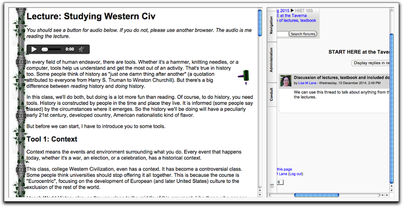
In Moodle I use the Weekly format, which essentially creates an interactive syllabus on the main page. Each week has links to that week’s work, and the weekly label can be customized with images and embeds (I use Voki). Here’s a sample Moodle week:
So it seemed logical to start in Canvas by using the Modules page. Let’s take a look at the same thing in Canvas Modules:
Oh, that’s lovely. And you can’t add any images. And it’s all the same color, sort of a sickly green.
Now, modules aren’t the only option; it’s just the option that organizes the material like an interactive syllabus, which fits my pedagogy. The other option is to group everything by type: all the discussions, pages, quizzes, etc., which is the default menu, just like Blackboard’s defaults. Yuck.
Want to change the titles of these? You can’t. You can only hide them. And, if you go into one of them (say, a quiz), the breadcrumbs will show even if you’ve hidden the category:
Ohhhh…kay. Well, I did try. I created a whole bunch of modules, and put them in order. But it was so ugly I couldn’t stand it. And all the lectures, since they’re on my own server, had to have the URL changed so they’d be SSL, otherwise they would not open inside the Canvas frame. And if I wanted an overlay for annotation, like Hypothes.is, that had to be scripted outside Canvas too. After about 7 hours of this, I realized I was doing way too much work.
What I was doing I call working the LMS “from the inside out”. This is what I’ve done with Moodle. I’ve been using the LMS’s navigation system as the core (in this case, Moodle’s weekly format, the interactive syllabus). When working from the inside out, you put as much as you can inside the system and then link out for whatever you must. This is how most faculty seem to work. It’s the standard sushi roll, wrapped in nori.
However, I have partly fought this, if only to retain control over my own creations. I’ve always written my lectures on my own HTML pages, so I’ve always linked out to those. And I’ve always had this ideal that I should only use the LMS for the things I can’t do outside it (quizzes, gradebook, forum). I said to a faculty member just yesterday, “don’t build in the system!”. But in actual practice, I’ve designed a great many things inside Moodle. But with Canvas, many of these are lost anyway (my images, Vokis, textual instructions), and the Modules page is so ugly, I’ve decided to change the entire workflow to work “outside in” for Canvas.
Outside-in means that the front door of my class, the main page, what used to be the big first page in Moodle, will be outside Canvas (though I will go all SSL and try to embed it). Then from that HTML page, I will link in to each item I can’t do outside Canvas (quiz, discussion forum, gradebook).
I supposed you could also call this a shift from linking out to linking in. But I’m kind of liking a sushi analogy. An “inside out” roll has the rice on the outside instead of the inside. It’s messier but it tastes better.
So, the California Community College’s Chancellor’s office, through its Online Education Initiative, is offering the Canvas LMS free to all colleges. There is a catch – if you adopt Canvas this way, your college is not allowed to use any other LMS. It’s a Canvas contract. A Mafia-style, old-fashioned, arm-twisting contract.
Faculty and other “stake holders” have made the decision to recommend Canvas, which surprises me exactly not at all. I spent useless hours on the survey offering my input, very shortly before the report came out justifying the changeover. I had chosen not to be on the committee that decided this (not that I was asked, you understand) because my forehead is already flat from banging it against walls.
So it’s time to learn to use Canvas. Yes, the instructor who wrote about the Insidious Pedagogy of the LMS will now be forced to change to an LMS with fewer features, options and control than the one I’m using. I can hear Alan Levine in the back of my head saying, “But Lisa, you only use the LMS solum pro procuratio“! Yes, I know. However, when you live in the same house a long time, your stuff builds up. You customize things for you. You move the hinge to the other side of the fridge, and cover up that gap in the floorboards with a pretty rug. After awhile you can move through the rooms at night with the lights off.
So I already know one thing – my pedagogy for my primary sources, the one I’ve published about, the main constructivist part of my class, won’t work in Canvas the way it has in Moodle. Like Blackboard (our other wonderful option), Canvas has “rubrics”, but neither lets you rate or grade a full screen of posts at once, as I do with Moodle’s dropdown ratings. Instead, it’s multiple clicks to grade each post.
I have tried every feature in Canvas (and Blackboard) to make sure I can’t do this in a similar way. I am using Moodle ratings rather than grades or rubrics – that’s what makes it simple. They translate automatically into percentage grades. And you can’t use ratings in Canvas or Blackboard like that – neither system allows instructor-only ratings
So up to now, I’ve been grading, with relative ease, about 35 posts per week x 7 classes. I will simply not be able to grade 245 posts one at a time every Thursday in Canvas. They’ll have to put me away.
Similarly, all the writing assignments have been graded on an open forum with drop-down ratings. ->
No can do.
So, the list of Canvas shortcomings compared to Moodle continues (please, if you know different, correct me!):
The course menu is very difficult to change, with strict limitations.
QTI format is required to import quizzes (Moodle had multiple formats – my zillions of quizzes are in Aiken).
Quiz questions are worth a minimum of one point each, and all quiz questions must be worth the same points. You cannot have a quiz with 20 questions worth 10 points.
Opening another tab for an open book exam is not possible.
Video is limited to YouTube unless you upload the whole file.
Viewing external pages within the LMS frame is only possible with SSL pages (and sometimes that doesn’t work).
Most tools are outside the LMS with vendors who may or may not be there later.
There is no capability to make a popup message for students when they log in.
There is no shoutbox (I use this as a quick forum on the front page with students).
There are no branched lessons, just forced pathways.
The only rating is “like”.
No Javascript is allowed (for security – theirs, not mine).
No iframes are allowed (more security – please remove your shoes before boarding the plane).
The pedagogy will have to shift to accommodate the limitations of the technology. I hate that. And I’ll need a screwdriver for the door on the fridge…
This is one of those posts I’m writing so I don’t forget how to do something.
After testing Hypothes.is for annotations, and realizing that the Redirect Tool in canvas would force an ordinary webpage with annotations to only open in a new tab, I figured out something.
Canvas will only embed secure (SSL) pages (those with an address starting https://). All my web pages are just plain ole http. But it turns out that my host, Lunarpages, can create an SSL page by just using the URL of the server (https://fand.lunarserver.com/username + rest of the URL). So any page I already have can become a secure page by using this URL instead.
So to make this happen automatically, here’s the workflow:
1. Create my own webpage with text and images.
2. Include the hypothes.is code in the HTML of the page
3. Use the Redirect Tool in Canvas, using the URL of the page, but with the Lunarpages server preface (in this case https://fand.lunarservers.com/~lisahi2/)
One of the big problems with Moodle is that the student profiles are connected to the central installation, not the course in which the student is enrolled.
This means that if I use the central Messages system to talk to students, I cannot tell which of my six (!) Moodle classes they’re in. They assume I can, since they Message from within the class. I spend too much time looking up which class they’re talking about.
So I tried a cgi form I adapted from somewhere, in text input boxes on the main page. I put the ?subject= code in each so I could tell which class they were coming from (the email would arrive with the course name in the subject line). But many students didn’t use it, and would just email me.
Some students need me a lot, so they email a lot, but I could never remember which class they were in and they could never remember to put the class name and section number in their email. In fact, many did not know what their section number was or what it meant, so I’d have three sections of History 111 and have to look them up even if they put History 111 in their email.
I could use a link with mailto:, but that opens a student’s email program on their hard drive. I don’t use my Apple mail, I use Gmail. They mostly use Gmail too, or at least web-based mail, like Yahoo. Hardly anyone uses a desktop program for Gmail anymore.
So I’m trying two tricks.
1) Gmail me
I surfed around until I figured out the code to get a link to open their Gmail so they can use my Gmail with my subject line. For History 111 #1337:
2) Google Circles
I turned on People Widget in Settings ->General. When a student emails me the first time, I look them up and put them in a circle corresponding to the class section they’re in (I made a circle for each class section). Then with the People Widget on, I can see which class they’re in right next to their email.
Moodle has always done something horribly wrong – each student’s information is not attached to the class they are in.
I teach at least five different classes in Moodle each semester.
So let’s say a student sends me a Message. I cannot tell which of the five of my classes they’re in. I don’t know which class to open to answer their question. And a few versions ago, Moodle made this worse in their programming by having student profiles be completely separate from the class anyway.
And yes, I’ve asked them to please put their course and section number in the e-mail. That’s running about 50% despite reminders. And it’s so 1998.
For several years, I’ve used my own cgi form, embedded in an HTML block on the main page. I used the form to automatically put in which course they were sending the form from. Thanks to the vagaries of browsers, I’ve had recent complaints that it sometimes doesn’t work.
I tried Quickmail, a plug-in for Moodle, but it doesn’t let me know which class the email is coming from, since its address for the student is the one in the main system.
How about Gmail? Here’s where the weird-ass workaround is.
I figure I should use Gmail to somehow create Groups from the rosters in the enrollment system. But Gmail doesn’t want you to do that – it wants you to add the names to a Group one at a time. Minimum 200 emails per semester. As if.
However, I can use the “Old Contacts” (rather hard to get to at https://www.google.com/contacts/u/0/?cplus=1#contacts) to add a list I’ve made in Excel as a CSV file, using the info from the enrollment system. So I can get them in a Group using Import.
But then, it doesn’t show me in the in-box which group they’re in. Or in their contact info inside the email.
However, if I turn on the setting to “Show the People Widget”, it will show me some info. Not the Group they’re in. But it shows the Circle they’re in. So long as they’re only in one Circle, that is.
So I’ve created a Circle for each class with the name and section number.
You can’t add a bunch of emails to a Circle – they’d all have to be individually selected from my Contacts. I can go down the list in Old Contacts and add them – one at a time. Might have to.
But at least now when a student emails me, I can look them up once and add them to a Circle. Then when they contact me again, I can see which class they’re in.
I suppose the sign of an educated person is that they can learn from anyone and anything. This week I’ve learned from a publisher’s product, and the design it uses could solve some problems. The question is whether those problems should be solved, and whether this is the best way to do it. I’m tempted. They’re doing some very cool things, these publishers.
The product is an interactive textbook, with videos and little quizzes built into the page. They are taking the idea of proximity to its logical extent – everything that relates to the topic is together. The design is intended to force the student to interact with the material several times while on the page, in an effort to reinforce the reading. The reading itself has been scaled down. Each chapter has five or six sections, each section is about four scroll screens, with a single column, lots of white space, and multimedia as well as text.It is obviously designed to look good on a cell phone.
It has many elements of a textbook, but frankly it looks a lot more like my lectures. My lectures have media all over the place. What they don’t have is an assessment element, or if they do have that (my History of England lectures have a little Javascript self-quiz at the end of each lecture) the results don’t go to the grade book.
I confess to being impressed (I’ve seen this product demo’d now with two different textbooks), and tempted to adopt. I’ve asked our tech admin to find out how I can integrate this (and other) products into an LMS.
No, go back, don’t be tempted! But I am struggling with student retention and completion as issues the administration takes seriously, so I begin considering adopting this product. What it lacks in breadth it seems to make up for in depth. At the end of each unit, it has students write a reflection that connects the chapter to contemporary topics, and puts their posts into a discussion board. It’s a well-designed “learning system”. I do not buy all their crap about “engagement”, but it does force interaction with the material.
Structured as things are now, this product would replace the textbook. That’s what it’s intended to do. So what is the textbook for? If it’s to provide factual background information to my lectures, this is way bigger than that. It has its own pedagogy and its own interpretation of the material. It requires a different kind of analysis than a new textbook.
My existing course design
First, If I were to assign such a “text”, what would happen to the other elements of my class? These are:
1. My lectures – reported by students every semester as their favorite aspect of the class, my lectures are my interpretation of history and contain embedded primary sources, music, video, and my own voice and video.
2. Primary source research – the second-favorite with students, and my first favorite, I’ve written on using the discussion forum as a lab and I wouldn’t want to lose this.
3. Quizzes – My quizzes now include questions from lecture (including primary sources) and whatever I’m using as a textbook.
4. Writing assignments – I’m down to only five of these per semester, all based on the students’ primary sources in #2.
Since the self-declared reason students drop my class is “the class looked like too much work”, which of these is sacrificed for the more thorough online textual experience? The quizzes might not be an issue, except that they help make sure students are understanding the lecture.
Product location and service
Second, the product is located in a separate web location, in order to make sure everyone is paying for it. I’ve examined several publishers’ products now. Most force you to go outside into what’s becoming their own LMS. Only one lets you bring links in by chapter. I’ve checked out their LMSs, and they won’t work for the primary source forums – forum design is still the weakest area of ed tech, even after 15 years. Most products “link” or “connect” to Blackboard and Moodle, so a student has single sign-on, but the location of the material cannot be put “in” to the LMS in a way that’s seamless. This undermines the whole idea of proximity that is central to the effectiveness of the product. The lack of true integration means that these publishers aren’t yet in the 21st century (I still have to use a phone to call in for their webinars).
Also, because it is not my product, and not a supported LMS, it adds a third layer of possible technological problem and need for support. Publishers are famous for giving you the world until you adopt the product, then not being much help. And everything’s dependent on their servers.
Catering to bad habits
Third, what learning preferences are we catering to with such products? All of the webinars I’ve attended begin with the profs taking turns stating what their greatest challenge is in teaching the x survey class. The answers are totally predictable: underprepared students, getting students to read the text, getting students to use what they read. How do we diagnose these problems? Students aren’t doing the reading, or they’d do better in the class. We want them to do better. We want them to learn. At the same time, we don’t want to lower the standards of the discipline.
The solutions in this product, the depth-over-breadth approach, rely on the “current research” on learning. Well, not on learning, but on student success. Student reading attention span is short, so the solution is to “chunk” information and given them less content. Their reading level is low, so we dumb down the text and put in links to difficult terms. They like video (actually, the publishers claim they learn well with video – I have not seen that to be true in practice), so we add more (short!) videos. Their attention drifts from the text, so we force them to click to see this map, and take a little quiz, and click on the video, and rearrange these items, and do a bit of writing.
So the whole structure of the product is to cater to students who cannot create their own learning pathways, who are accustomed to having everything designed for them, who have difficulty reading and remembering, and who do not know how to study. We support all of these bad habits with this approach, but also use technology to reinforce some depth of understanding.
Weighing the considerations
I’m looking at three ways to go here:
1. Adopt: Foreground the retention concerns and adopt the product, jettisoning at a minimum my quizzes, and making lecture viewing optional. Figure out how to put it into Moodle so I can use the forums for primary sources. Or dump those too.
2. Redesign: Balance the retention concerns with my own pedagogy, by adopting the useful elements of the product using my own technology skills – putting mini-quizzes and pop-up definitions inside of lecture, and dumping the DIY textbooks I’ve been using. This would be, obviously, a huge amount of work.
3. Keep Calm and Carry On: Ignore the retention concerns and continue with my design, which requires extensive reading, weekly 25-question quizzes on lecture and text, weekly primary source posts, and five writing assignments based on these, a workload far less than what I did as a freshman, but which is increasingly becoming anachronistic in a world of weekly log-ins, minimal reading, low-stakes self-checks, and low grading standards.
I confess to being tempted by #1 for the first time in my career. Undertaking #2 is more like a sabbatical project, and could take all my time, but I’d like to explore the options in future posts. #3 is of course the default, encouraging my own bad habits.
The dark side does have cookies. They taste better now, even if they’re not good for you. And we seem to be in a world where everyone just wants dessert, higher grades for less work. Whither the artisanal prof who cares about her field?
It’s pretty clear, even in recent studies, that we want to present information to students in “multiple modalities” (text, graphics, video). But there have been a few studies discussing the placement of “learning objects” (text, video, images) on a webpage, and how that placement relates to learning. The results of a 10-year study at UCSB by Richard Mayer and colleagues focused on how best to use audio, text, video and other media elements (1) . They discovered that how media elements are handled on the screen impacts learning.
Improved learning resulted from adding graphics to text, and from adding text to graphics. But “[t]he trick is to use illustrations that are congruent with the instructional message”, rather than for effect or entertainment.
Interestingly, a conversational tone and the use of an “agent” (a talking head video or animated cartoon), even just the voice, also helped learning.
Explaining graphics with audio improved learning also. But too much was overload. Audio and text explaining a graphic decreased learning, and any gratuitous or dramatic elements added only to get attention caused distraction and also decreased learning.
Putting the issue of relevancy aside for a moment (obviously the text and graphics should both be trying to further the same instructional goal), I think the important issue is proximity. If there is a graph at the top of the page, but the graph is explained with text three paragraphs later, I don’t think it will help.
Proximity is critical, because the relationship between objects that may be obvious to instructors may not be obvious to students.
In my online lectures, I have always put illustrative images next to the appropriate text. I remember in the late 90s repeatedly looking up a cheat sheet my mentor, Kathleen Rippberger, made showing me how to write HTML to wrap text around an image (thank you, HTML). Over time, I came to embed videos, then YouTube videos, also within the lecture page (thank you, embed code). This year, I began embedding the primary sources right into the lecture (thank you, iframe).
The desire to keep things together even caused me to explore putting a lecture and the corresponding discussion together on the same page, which I could do using iframes in Moodle. But the effect is still not seamless, and it looks awkward on mobile devices.
If we extend the principle of proximity to the defaults on a typical Learning Management system, however, we will be disappointed. I despair as I look at Blackboard’s default menu, with everything separated: “course materials” here, discussion forum there, tests way over there. It was this problem that led our instructors to create the main page as an interactive syllabus. But even there, the page is a list of links:
The goal of proximity explains why so many instructors try various forms of “modules” and “units”, which seem to me like online versions of the paper packets we used to use in grade school.
Proximity thinking has come a little late to online education, but it needs a place at the table. The delay has been caused by not only the LMS, but by all the reasons the LMS is popular, including deceptive plug-and-play functionality and ongoing difficulty creating structured learning experiences if you aren’t a web-head. Time to consider proximity as its own design concept, within the LMS if necessary.


 But you can eventually set up your new home the way you like it, so this analogy doesn’t fully work for an LMS. For me, Moodle was like running my own restaurant, with table service. Canvas has reduced me to a drive-thru window. It is difficult to present your meal attractively or in an appetizing way through that window, though I can package it for you conveniently so you can take it with you in a box.
 My adventure moving from Moodle to Canvas begins. And I’m thinking about sushi.

 Now, modules aren’t the only option; it’s just the option that organizes the material like an interactive syllabus, which fits my pedagogy. The other option is to group everything by type: all the discussions, pages, quizzes, etc., which is the default menu, just like Blackboard’s defaults. Yuck.
 What I was doing I call working the LMS “from the inside out”. This is what I’ve done with Moodle. I’ve been using the LMS’s navigation system as the core (in this case, Moodle’s weekly format, the interactive syllabus). When working from the inside out, you put as much as you can inside the system and then link out for whatever you must. This is how most faculty seem to work. It’s the standard sushi roll, wrapped in nori.
 Outside-in means that the front door of my class, the main page, what used to be the big first page in Moodle, will be outside Canvas (though I will go all SSL and try to embed it). Then from that HTML page, I will link in to each item I can’t do outside Canvas (quiz, discussion forum, gradebook).
 So it’s time to learn to use Canvas. Yes, the instructor who wrote about the
 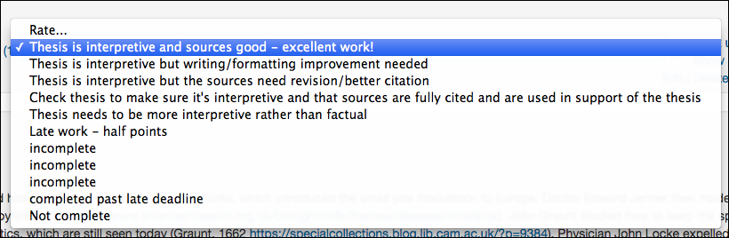 posts per week x 7 classes. I will simply not be able to grade 245 posts one at a time every Thursday in Canvas. They’ll have to put me away.

 One of the big problems with Moodle is that the student profiles are connected to the central installation, not the course in which the student is enrolled.
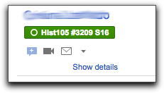
 For several years, I’ve used my own cgi form, embedded in an HTML block on the main page. I used the form to automatically put in which course they were sending the form from. Thanks to the vagaries of browsers, I’ve had recent complaints that it sometimes doesn’t work.