It’s been awhile since I’ve posted so I remember something, but a faculty member asked how I did this:
It looks like it’s just a link in the menu that says “* Message Lisa”, but it’s so much more. You’ll notice to the left, in the system-wide blue menu, is the Inbox. This is what students are told to use to message their instructor. But when you go there, you have to search for the instructor, by course and by name, before you get a window where you can type your message. That’s stupid. It should be easy to contact your instructor.
But my “* Message Lisa” link doesn’t just go to the Inbox. It opens a window immediately where they can type their message, with all the fields (their course, their name) filled in already. No searching required.
For that link, it’s tricky. Each course in Canvas has its own link to the instructor’s inbox. The format is this:
To find the course number, you can go to any assignment inside your class and look at the URL, or you can mouse over the class tile in the Dashboard. To find your user number, mouse over anywhere your name is linked in the class (like at the top of an Announcement). To find your user name, see your Profile.
Then I use the Redirect App in the Settings – Apps, and create it as a link, just changing the course number for each course. It rolls over each term, so I just have to change the course number each time.
During the pandemic year many faculty have been forced to create fully online classes in a Learning Management System, such as Canvas or Blackboard. It has been surprisingly difficult. Even those fluent in technologies like email and social media have been flummoxed by the difficulties of using the LMS as an online classroom. There are three main reasons why.
Got folders?
Learning Management Systems appear to be innocent shells into which teachers load “content”, but in reality they each have their own built-in pedagogy. This pedagogy is often archaic and is based on outdated norms of information organization. In the 1990s, LMSs imitated the folder-style structure of Mac and PC (Windows) operating systems. They were really just places to upload content items (usually Word files) and perhaps run a single discussion board (by 2005 or so).
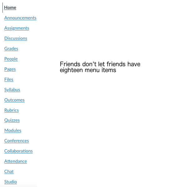
Surprisingly, even when LMSs added more and more features to enable greater interaction and activity, they retained the old structure. It is designed to present material by type: Pages, Lectures, Discussion, Grades, etc. You can see this in the way the menu is constructed.
Presentation by type undermines the organizational integrity of the course. Most scholars think in terms of their field, and how best to present its habits of mind. As teachers, we think next in terms of wrapping elements together to encourage understanding. We do not think in terms of all the articles, all the lectures, all the exams, all the discussions.
Instead, we think in terms of weeks, or units, or modules. We section the learning, combining various elements to cover a particular subject. Separating those resources by type makes no sense when one is creating a pattern of learning.
One solution is to break this framework. If the LMS allows us to add, delete, or hide menu items,we can make new pages which link to the whole pattern of information. It may be possible, for example, to have the menu say Module 1, Module 2, etc., instead of Announcements, Syllabus, Pages, Discussion, Quizzes.
Even so, the system may force its own design. We may have a Module 1 page with all the links to activities, but when the student clicks on that activities, the breadcrumbs may show the folder name (“Quizzes”). Students can get lost following these.
Student-led what?
None of the major LMSs make it easy to implement constructivist or connectivist learning theory. Unlike twenty years ago, instructors may have studied and be trained in active learning teachniques, and have been using them in the classroom. When faced with the LMS, they find themselves stymied.
Created student-led or student-designed work is difficult. LMSs require teacher permissions to set up an assignment, quiz, content area, or discussion. Although some discussion forums allow students to begin topics, this feature must also be set by the instructor.
Some systems seems to be more adaptable, or at least expandable. In LMSs like Canvas, LTI’s (tools using the Learning Tools Interoperability standard) can be added to the system with varying levels of success. An example might be an improved discussion board, or Google Docs, or a group annotation app. Some integrate fairly well into the LMS, making them easy to access from inside the shell and pushing grades back into the system. But all require a bit of technical expertise to set up, and the integration is rarely seamless. Some, like Google Docs, may require students to have a separate Google account, while others need their own structural folder inside the LMS for all activity related to that app. This is particularly true of textbook publishers’ material, which often tries to integrate the publisher’s own textbook site with the LMS.
The solutions here take one of three directions: the internal approach, the LTI approach, or the textbook publisher approach.
Since students can be given control of discussion boards, the internal approach would include using them for different kinds of activity other than discussion: posting lists of websites, sharing resources, posting quotations from reading. The other folder areas (quizzes, pages, etc) can simply not be used.
The LTI approach would involve using more collaborative tools, like Google Docs or group annotation apps or pinboards as the main outside tool, with the instructor learning it well and monitoring it thoroughly.
The textbook publisher approach would be to ignore or hide everything possible in the LMS navigation and use the publisher’s folder as the main work area.
Fifteen papers due today!
Gone are the days when your class was the only online class students were taking. They are now enrolled in many classes within the same LMS at the same institution. In an effort to help them remember the deadlines for everything, the LMS aggregates all the information from all the courses into task lists, using a Calendar or To Do feature.
For example, a conditional release feature makes it possible to prevent a student performing Task B (a test) before they have done Task A (an assignment). Task A is designed to prepare the student for Task B, and ideally would be done within a short period of concentration. But on the student’s Calendar they see Task A, then Task 1 from another class, then Task iii from yet another class, before Task B. By the time they get to Task B, they have no idea what was learned in Task A. An example from three of may classes, running at the same time:
Same day, three different classes
Perhaps you have designed a module to lead students through an introduction, then a short lecture, then a video, then a discussion, then a test. All of these will be disaggregated by due date and will appear in a jumble on the students’ Calendar. Wrapping elements for your class together to encourage deeper understanding becomes impossible.
In addition, by listing all the tasks from all the classes together, the Calendar or List “flattens” all the assignments. It becomes impossible to tell which tasks are more or less important to the student, to learning, or to the grade. They all look equivalent in the same font and size, even if one is a two-minute video and the other is a paper that would take several days.
Unfortunately, this problem may not be solvable. Few LMSs allow control over whether or not to show calendars and lists to students. Because permissions for such features run above the individual course level, instructors usually have no access to any methods that would change the LMS behavior.
The bottom line
Creative pedagogy can work within the limitations of the LMS, but it is not easy to implement. Systems are designed to systematize, and the LMS is designed to create cookie-cutter classes based on outmoded structures rather than to promote innovative approaches. Thus for many of us, understanding its design is essential to adapting, subverting, or acquiescing to its suckiness.
Instructure’s Canvas continues to gain market share as the Learning Management System in colleges and universities, despite limitations which have become more apparent as more faculty teach online. Want to assign extra credit? That’s really hard. Want students to maintain individual graded journals? Super difficult. Want to use the shell to create student-led learning? Forget about it.
And yet schools have been overjoyed to adopt Canvas as the new friend who will help with everything while not having too many needs. It’s so easy to use, everyone says. It looks so simple and clean and Google-y. Students like how all their classes look the same, reducing their cognitive load.
But for the more creative teacher or professor, those interacting with it intensely rather than casually, associating with Canvas exposes its shortcomings and begins to cause frustration. Faculty who have had more useful relationships with other systems know exactly what’s missing, but even those new to the playground are stymied when trying to get a simple friendly response.
The fact is, Canvas is not our friend. That’s because its design forces us to engage with its emotional problems.
Navigating like it’s 2005
Canvas is stuck in old patterns of thinking, even when those patterns cause problems again and again.
Learning Management Systems appear to be innocent shells into which teachers load “content”, but in reality they each have their own built-in pedagogy. Canvas’s pedagogy (like its other market leader, Blackboard) is based on outdated norms of information organization. In the 1990s, LMSs imitated the folder-style structure of Mac and PC (Windows) operating systems. They were really just places to upload content items (usually Word files) and perhaps run a single discussion board (by 2005 or so).
Surprisingly, even when LMSs added more and more features to enable greater interaction and activity, they retained the old structure. It is designed to present material by type: Pages, Lectures, Discussion, Grades, etc. You can see this in the way the Canvas menu is constructed.
Most teachers do not think in terms of “type”. We think in terms of weeks, or units, or modules. We section the learning, combining various elements to cover a particular subject, assigning a reading, practice test, discussion, and exam all on the same topic. Separating those resources by type makes no sense when one is creating a learning pathway for students to follow, and can undermine the organizational integrity of the course.
Trying to help
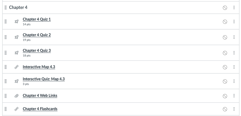
But Canvas promises an alternative navigation for the students: Modules. You can put all your tasks in the correct order under headings. The “Back” and “Next” buttons, which automatically follow your sequence, will ensure that students stay within their lane.
Exciting Modules page for Chapter 4
Unfortunately, this doesn’t solve the problem. Canvas’s Modules page is a list of links, with every item listed in the same size and color. But the menu items, ever visible even on the Modules page, will still say Pages, Assignments, Discussion, etc.
One can try to break this framework. Since we can add, delete, or hide menu items, it is possible to make new pages which link to the whole pattern of information. It may be possible, for example, to have the menu say Module 1, Module 2, etc., instead of Announcements, Syllabus, Pages, Discussion, Quizzes.
You could use the Modules pages as a home page, even though it’s ugly. Or you could make all the menu items for types invisible, and build a Home page with a schedule or grid, and each unit could be a list of links. Students can then see how everything fits together for that week.
But no…
Both solutions will be undermined by Canvas’s internal navigation. Even if you set up Page-based or Modules navigation, the “breadcrumbs” will show everything by type anyway. Any student going from your Week 2 page of links to Quiz 2 will see a breadcrumb in the upper left saying “Quizzes”. It they click it, the full list of all the quizzes in the class appear. Ditto with Discussion 2 — the full list of discussions will be there, and students will start jumping around and get lost.
Canvas provides the way to make things right, then undermines its own good intentions.
Working in five classes at once
Canvas wants everything combined for convenience, ignoring all your plans.
Let’s say you create a learning pathway through the content, considering the holistic nature of your course, using Modules or Pages. The Calendar and the To Do list will immediately come along and destroy your careful course structure, by disaggregating all the tasks in all your students’ various classes and lumping them together into a giant list.
For students, as a convenience, the Calendar lists everything from all their classes in order of due date. When they look at the month’s or week’s tasks, everything from all their classes is listed, making it difficult to see the order of anything for one particular class. Your “Discussion 2” which you carefully designed to follow Reading 2 has another class’s “Discussion 4″ in between.
The To Do list does the same thing in an even simpler list that appears on the Dashboard and every course home page.
In addition, both the Calendar and the To Do list don’t include anything that isn’t graded. That might include the week’s main page, the discussion students are supposed to return to on two different dates, or a required reading. Students will miss ungraded assignments entirely as they innocently follow these helpful lists.
What to do?
Because the Calendar and To Do features are controlled above the course level, there is no way to make them invisible or change them, except by adding more items from your class. There is limited space in the title, especially when the Calendar or To-Do List is seen on a phone, so we cannot put “Eng101” as the first word to help. But we can add additional Calendar items for things that aren’t connected to a graded item: “Week 2 starts today”, or “Return to discussion”, or “essay corrections due”. When we make an ungraded assignments, we can check the “Add to To Do list” box. Adding more things to do may be, strangely, the best way to help students.
Relying on others for basic functions
Canvas has no inner reserves of strength, and relies on outsiders.
It is a truth generally acknowledged that Canvas’s discussion boards are the most troublesome element of the LMS. Conversation is not its strong suit. Canvas requires an administrative setting to do things like make the barely nested posts obvious in a threaded discussion. There is so much white space that one scrolls until one forgets the topic — it isn’t practical to engage in extended, much less semester-long, discussions. There is no distinction between instructor posts and student posts. The toolbar cannot be customized, so it has become bloated and even more difficult to use than when it had fewer features. There is no @ feature or notification sent to students to let them know someone has responded to their post, unless they subscribe to all posts on all boards in the class.
Canvas is very instructor-focused, making student-led learning difficult to design. There are no collaborative or whiteboard spaces built in. Extending Canvas means using LTI (Learning Tools Interoperability) apps, or what used to be called “plug-ins”. These are made by external providers, and vary widely in cost and ease of use. Some integrate better than others, passing grades back into the Canvas Gradebook with ease. Others force students to create external accounts.
Given these difficulties, it is often easiest for faculty to succumb to the temptation of using a big stick: the textbook publisher package. The big companies offer full packages that can plug in to a Canvas course, essentially connecting their own learning management system to Canvas. This adds another layer and another (sometimes more than one) menu item as a “type”. Then it becomes necessary to spend much time learning the publisher’s complicated system as well as Canvas.
Less may be more
The only solution here is to limit oneself to one LTI. If it’s the publisher package, all the time will be spent learning and dealing with that. If it’s Google Docs, that will have a learning curve too, and possibly external accounts. If group annotation is desired, that can be the only extension.
Being honest with each other
These three big flaws don’t even include the many inconsistencies and gaps that Canvas has had since the beginning. There is no way to change things in bulk, like assignment due dates or quiz instructions. There is no pop-up to alert students that a message awaits from their teacher. There is no font customization on the Modules page, which flattens everything and makes it look like a two-minute video is equivalent to a twenty-page chapter. The drag-and-drop Calendar won’t let you drag-and-drop items from one month to another.*
One should not expect a friend, especially a troublesome friend, to change. Until 2015 there was a chance the relationship would improve. Indeed, things had been improving with help from the Canvas Community, a rich resource of teachers and expert users. But once Instructure went public, they became answerable to shareholders, just like Blackboard. Their “open source” street cred died, as did their need to respond to users.
It may be be best to consider Canvas as a flawed, if necessary, companion. It has its own desires and needs, which will often be counter to yours. But its unreliability means it’s best not to get too dependent.
*Update: Kona Jones has pointed out to me a couple of revisions. One can drag-and-drop to a different month if you start with an undated item from the list, and a recent update now means that Canvas includes bulk editing of Assignment dates only.
So many instructors, some of whom have used Canvas as their LMS for their on-site classes, are now encountering the system’s complexities and limitations. Teaching fully online is different from posting ones class resources online, or at least it should be.
My advice has changed from three years ago, because Canvas itself has changed. My reasoning, however, has not changed from eleven years ago. My article on Insidious Pedagogy: How course management systems affect teaching (2009) explained how the designs of learning management system tend to control pedagogy, especially among novice users. We need to spend some time working against the system.
So I’ve reduced my top ten tips to three. And they may well be suitable for LMSs and VLEs other than Canvas.
1) Create full navigation using Pages
As with LMSs of old, Canvas continues to default to grouping content and assignments by type. This is a holdover from Blackboard, which relied on the early computer analogies of “files and folders” to imitate paper filing systems. So “Lectures” can be a folder, “Discussions”, “Quizzes”, etc.
But for most of us, learning is time-oriented, or theme-oriented, not type-oriented. We tend to have units with multiple types of content and activities. Many of these are organized by unit or week. There is no way to express this to students without making a page of links.
Canvas, of course, has a Modules page with a list of links. On the Modules page, you can load in everything, and have students do things in sequence, or with prerequisites, or both. The Modules page is, and has always been, ugly. The most you can do is add emojis to the headings, if you know how. And every item listed on the Modules page is the same size and color, creating the impression that everything listed has the same worth. All you can do is indent, or use caps.
The best Canvas classes I’ve seen have a schedule or grid on the main page:
Each of the links goes to a Canvas page, which has links of the activities and content:
One can of course put all these in the Modules page also, which will enable the “Back” and “Next” buttons for those into sequences and control. Then it’s up to you whether to show that Modules page, because you also ought to. . .
2) Hide menu items
This has not changed from earlier advice: features we are not using, or that we don’t want students accessing from the menu, should not appear on the menu.
For Canvas, this involves going to Settings – Navigation and dragging the items you don’t want visible down to the inactive area. It used to be that when you did this and saved, neither you nor the students saw these items on the menu, and the look was clean. Recently, Canvas changed this so that the instructor sees them all, but with the hidden items indicated by a crossed-out eye.
Well, at least students don’t see them.
3) Do low-stakes stuff anyway
Here working against Canvas means working with it. Students need reasons to work on your class, and to get immediate feedback. This is difficult in Canvas. Doing extra credit, creating short quizzes, using test question banks, all are ridiculously complicated. And there is still no easy way to just copy a quiz.
Canvas will also passively prevent what you want to do. Want to create a discussion forum where everyone who posts twice gets 3 points? Can’t do it. Want to have 20 questions on a 10-point quiz, so each question is worth half a point? No can do. Want to rename an assignment and have all the internal links still work? Good luck. Want to change all 28 due dates to a week later? It’s a one-at-a-time job. (At least there’s a hack for this one.)
It pays to spend some time seeing what can be done with zero-point assignments, and complete/incomplete grades, and the default grade feature in the Gradebook. Students learn from short, formative assessments.
Working against the LMS has always been required for us to teach the way we want to. More and more, I see LMS trainings covering these problems, and teaching the workarounds, which is great. Particularly when your LMS is owned by an equity firm, after going public and answering to shareholders, we can be sure that improvement is unlikely (most Canvas problems have been around since its inception). We must be willing to work against the system.
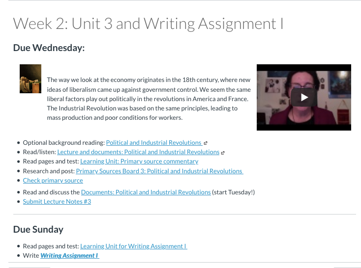
I remember this exercise from grade school. We were given a list of terms, and told to use them in a paragraph. Not define them, but use them.
If I’d done the reading, this could go several ways. If I’d understood the overall point of what I had read, the first sentence of the paragraph was easy, and then I could assemble the terms, sort of, even if I didn’t know what they all meant. It was like a deductive method. If I knew what they all meant but not how they went together, I could still write something, and if the sentences followed each other logically, I was good. Let’s call this the inductive method.
If I hadn’t done the reading, of course, I was f***ed.
Necessity being the mother of invention, I had a hole in my syllabus when I dropped my History of England textbook. Well, textbook is a bit of a misnomer. It was a brilliant atlas, deeply loved (by me, anyway) but hard to obtain. With the book gone, what remains are only my lectures and the primary sources for readings. Of course, that’s quite a bit. My lectures are fairly complete. More importantly, the sources are items like Magna Carta and More’s Utopia. I want them understood, so I’ve put them in Perusall for annotation. But group annotations are a bit deceptive — it’s entirely possible for the individual student to have misunderstood an entire document.
So since I have no intention of writing multiple-choice quizzes (ick), I instead have created Document Paragraphs. The instructions say:
While I haven’t actually said “use these terms in a paragraph”, that’s what they do. And I can very quickly tell what they understood and what they didn’t. It also helps align the Persuall annotations (which I call Read and Discuss) with something they must produce. It scores an automatic 2 points, but for the first several weeks I’m very careful about giving them feedback to improve, if needed.
So just a note to thank all those teachers I had for “use these terms in a paragraph”.
In all my years of online teaching (and it’s over 20, mind) I have never had a worse start to the semester. My inbox is receiving student messages at the rate of about 3 per hour, and has done the entire first week. These messages are, as I’ve mentioned before, mostly related to not being able to find things. Many indicate that they haven’t read my announcements, so all have required individual responses.
This is heart-breaking for me, and not because of the time suck. My navigation in my courses has always been my pride. Students frequently mention on evaluations the ease of getting around the course, the knowledge of knowing what is due and when, the way the class hangs together. One Canvas feature, the To-Do list on the app, has put an end to all of that.
When the LMS undermines the integrity of my courses, it puts me in a bind. The disaggregation of content creates larger problems, as I’ve noted. I am being defeated by Canvas. The question is whether I can snatch honor from defeat.
The solutions I articulated last time, the new rules, are proving to be difficult to implement in Canvas.
For example, it is clear that proximity of content to task is crucial when students engage class material through disparate tasks. Reading must be together with a quiz or writing on that reading. Self-reported items must have the self-reported task alongside the submission. So what’s the problem?
The To-Do Lists
Canvas makes this much more difficult than it has to be, because the To-Do list itself is a fickle beast. Over the last 48 hours, I have learned a lot about it. There are, it turns out, several To-Do lists. One appears when you open the Home page of the course itself (let’s call this List A):
It includes Calendar events, so it would tell students everything they need. Unfortunately, it is useless, since the problem is that students no longer go to the course Home page in the first place.
Another To-Do list is on the new, improved Student Dashboard (List B). For some reason, it prefaces everything with the words, “Turn in”:
This is on the right side of what is basically a home page for the entire Canvas system for the college, and the Canvas folks don’t seem to understand that students don’t go there either. One reason is that it’s utterly cluttered with college announcements. It also does not include Calendar events.
Here is what students see in the tool they’ve suddenly started to use now that all their MiraCosta classes are in Canvas, the aggregated To-Do list on their phone in the app (List C). It also uses “Turn in”:
No Calendar events, no ungraded assignments. Here are the other things they can see on their phone:
The Inbox (Messages)
Notifications (the default is Announcements and Message)
Events (which shows only those manually added to the calendar)
Dashboard with tiles
My student account is set as a student in five of my classes, so imagine all these from different classes, in different colors.
As far as I can tell, almost all of the students now only use the To-Do list in the app, List C. The questions I’ve received indicate that few use the Notifications, which is where all my Announcements would appear. These don’t appear on the To-Do list, implying that reading them is not something one needs To Do.
The Attempt to Solve This
Since they cannot see either the week’s readings or my lectures in the To-Do list, surely the trick was to get these to appear.
Option 1: Add everything to the Calendar as an event on a date
This would be easiest, but it didn’t work, because the app To-Do list does not show Calendar events.
Option 2: Make a page for each reading and lecture and check the box “Add to student to-do list”
I thought I could make a page for each reading and each lecture, then click the “Add to student to-do list” box, and they would be visible!
But it turns out this is not the case. Things added using the “Add to student to-do list” box only appear on the Course home page list (List A) or the Student Dashboard (List B), not the app To-Do list.
Option 3: Make readings into 0-point assignments or ungraded quizzes or surveys
No dice. It turns out nothing will appear on the To-Do list in the app unless it is a graded discussion, assignment, or quiz.
So that leaves me with only one option: make everything graded.
Grading and ungrading
No way am I grading every time they do a reading or view a lecture. Out of the question.
So the other possibility: ungrading.
I have never been a true believer in ungrading, or in the honor system. I allow it for some items, but not for others, and for those self-reported items I not infrequently discover plagiarism, dishonesty, or inferior work. The point of the system is to give feedback on this work, which I can do only up to a point.
The way to force ungraded tasks to appear on the app To-Do list is to adapt Laura Gibbs’ brilliant self-reporting quizzes and embed the material or link it in the instructions to that quiz.
So each lecture link would go to something like this:
For readings, I could adapt the trick I’ve been using to bring proximity to readings and homework assignments: use iframes to embed the reading in the instructions of the quiz. Then each reading link will go to something like this:
For six classes, needless to say, this will take a huge amount of time.
Now some people may say, “But Lisa, what happens when Canvas changes everything? It worries me that you might have to do all this work again!” As the Scottish policeman said in Casino Royale (1967), when it worried James Bond that he was a French police officer but had a Scots accent, “Aye, it worras me too.”
The Justification
As Jeff Goldblum’s character noted in The Big Chill (1983), it is impossible to go through the day without a juicy justification — it’s more important than sex.
So here I will defend a system in which I don’t believe: the honor system. Clearly, if everything that is assigned becomes a self-graded or auto-graded quiz, we’re on the honor system automatically.
I return to Stephen Downes’ idea of education: that it is the role of professors to model and demonstrate, and the role of students to practice and reflect. I think, frankly, that reflection is dead when the content and tasks are disaggregated. So what’s left is practice. The doing of history is what’s important, and I will grade it when they do it: writing assignments will always be graded by me. The rest will be (ungraded) practice, for points.
This will create an environment of trust (um….ok) and responsibility for learning (yes indeedy). [Suppressing cynicism will become my new watchword. Whiskey may become important.]
But wait, there’s more!
Possible further changes, then, after the zillions of hours making quizzes for the unquizzable, would include:
1) changing from weighted categories to points accumulation, because there’s no point in weighting anything
2) returning to Modules (which I just happily jettisoned) to force task completion
3) using Modules as the ugly home page to eliminate beautifying a Home page no one uses
4) eliminating the weekly pages I decided to keep instead of using Modules, which would entail losing all my introductory videos because it’s stupid to put a 2-minute Voki on a quiz
5) eliminating all multiple-choice quizzes because (a) I get too many student questions about them, (b) it isn’t really practicing to do them, and (c) Canvas can’t properly handle test banks anyway and I’m always having to fix them
7) sorting out the remaining problems: getting students to the Information page (which is a FAQ they need), and forcing them to return to a Discussion that they think is completed after only one post
Thomas Jones Barker, Death of Captain Nolan (1855)
I certainly didn’t mean for the relationship to end suddenly. It has been tenuous for awhile, various arguments and complaints, but I always thought it was a communication problem. But finally I had to walk away.
In my History of England class, the textbook has been an issue for a long time. The most suitable and available academic text, by the Messrs Roberts, is two volumes, so that won’t work. The class is, unfortunately, only one semester (we have two for the history of the U.S., with a much shorter history). And realistically, even one volume is asking for trouble.
All the books I’ve used, including works by Roy Strong, Asa Briggs, and F.E. Halliday are outdated, out of print, or both. These have been replaced by volumes that sell well in the U.K., but require a previous knowledge lacking in American students: works by Jeremy Black, Simon Schama, and Simon Jenkins. I’ve been using the Penguin Illustrated History, which I love. It’s visual, I’ve written a bunch of quizzes for it, and it’s beautifully written. But students have become less enthusiastic, and it’s outdated now anyway.
Besides, it costs money. All my other classes require only my own pdf textbook, freely downloadable and printable. We are now required to indicate in the class registration system if we have a low-cost or no-cost class, so that automatically creates competition among classes as students realize they can take a class for less money. This was my last class with a textbook that had to be purchased, and it wasn’t easy for the bookstore, or students online, to find an inexpensive copy. So I unceremoniously dumped the textbook, and spend a couple of weeks this summer downloading, editing, and reformatting appropriate pages from the web. Then I wrote matching quizzes.
Canvas is not user friendly when it comes to importing, editing, and reusing quizzes, in any format. It’s test banks are obscure and hard to use. The result of my machinations was a set of single-question, matching quizzes for the new readings, and my old (now five-question) multiple-choice quizzes for my lecture. So I put one due Wednesday and the other Sunday.
Well, now the weekly course page was becoming really cluttered:
I don’t want to go all Copernican on this, but if I were a student it’s starting to look like hoops to jump through, instead of ways to explore material.
So I thought, what do I want them to get out of the reading anyway? My lectures already have a good outline of the main events of English political, social, and cultural history. And the depth is already provided by the documents we “read and discuss” (i.e. annotate in Perusall) each week. These readings are pretty intense for today’s community college students (Magna Carta, Archbishop Cranmer). So instead of adding new readings, it may be better to have them deal with these documents more.
I spent yesterday deleting all the quizzes, both lecture and reading. Instead, I’m having each student submit a “Document analysis paragraph” which uses all the names of the documents to support any single idea they have about the era we’re studying. I made a silly sample paragraph to model what I want them to do:
It’s in the form of a single-question graded survey, which will automatically apply points if they turn it in, so I can read them at my leisure and communicate individually with students who are struggling. And now students are doing, not reading and quizzing.
And thus I’ve broken the entire reading/quiz cycle in one swoop. I didn’t set out to do this — it just happened. But I’m pretty sure I’ll have no regrets.
Canvas’ messaging system sucks. Always has. Its new and improved version isn’t much better.
If you’re a student, and you want to email your instructor, there’s no easy way. You have to know that among the ever-proliferating global items in the far left menu, “Inbox” means the internal messaging system. You must also know already that it is for both “in” and “out” messages.
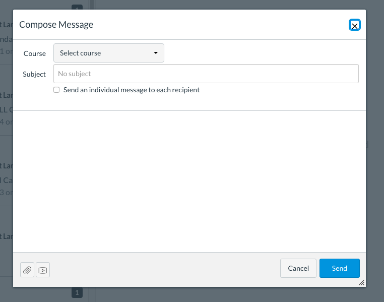
Then you need to know that this symbol is to write a message:
So you click there and it’s blank. If you have more than one class in Canvas, you must use the dropdown to select your class (which means you must have memorized what the official numbering system of your class is).
Then you must use Search to find your instructor’s name (so you must know not only who that is but how to spell it), or know to select “Teachers” to find your professors.
It’s always amazed me that students ever figure it out.
So I use the “Apps” to create my own menu item that sends students directly into a Message to me.
How to:
Go to Settings – Apps. The “Filter by name” and type in Redirect. Click on that app’s logo, then Add App.
This opens the Redirect App, so fill in the blanks.
The Name is what you want it to say in the course menu. The URL is your version of this:
Change the server to your college’s canvas server, the course id to that particular course (it’s in its URL), and the user id and Canvas name to yours. Be sure to uncheck “Force open in new tab” and instead check “Show in Course Navigation”. Add the app, go back to Home, and you should see it in the course menu. Test it!
If you make a mistake or want to revise, use Settings – Apps – View App Configurations.
Now when a student clicks on that item in the menu, a Message opens, with your name as recipient and the course name already chosen. Not easy for us (you have to change the course id number every term) but definitely easier for them.
This is another post where I share how I did something, solely so I don’t forget how to do it.
Perusall is a wonderful program for annotating documents with a whole class, and I’m currently using it for all my online classes, which are located in the horror of an LMS they call Canvas. I upload a PDF, and students and I can highlight the document, with a panel popping up for discussion. When anyone clicks on the question mark, it indicates a request for responses. When anyone uses @Someone, it notifies them someone has responded. I have used it to solve the “what if they don’t do the reading?” problem, since we all kind of do the reading together.
All this is great. The system “auto-grades” (though I have to set it then check it very carefully), and pushes the grades to Canvas gradebook on my command, so I can focus on the discussion itself instead of evaluating it.
But you can’t do this with images — just upload and everyone talk about it.
Except…you can. Perusall won’t upload images natively, nor link to images directly on the web. So I downloaded an image, and saved it as a pdf in Preview, then uploaded it. Then I clicked on a section of the picture. Instead of highlighting text, Perusall put a pin. I can then ask a question or make a comment about just that portion of the image. Click the pin, and the conversation panel opens.
But the interface itself takes up a lot of the screen, which we don’t want for images. So I’m going to show students what to do about that:
If they do it, then it will look like this:
More room for the image, less clutter. I’m thinking it would be possible to put several images on a page to be discussed for that week.
What it’s doing is similar to ThingLink, which I learned about from our wonderful art historians over a decade ago. But ThingLink and similar programs, although they can be embedded into Canvas with iframes, cannot track a student’s comments, nor auto-grade them. Perusall can, which shortens my workflow so I can focus on the discussion, just as I do with annotated text.
So, annotations for images when I teach a European history course that focuses on the Humanities, and a History of Technology class that can get bogged down in text? I’m in!
One of the most annoying things about teaching many sections using an LMS is that instructions must be repeated in so many places. Partly this is because people forget from one week to the next what the instructions are, so proximity of instructions to a specific task is necessary. And we all know that students do better when instructions are repeated and reminded in at least three places.
But what happens when you want to change instructions for a particular kind of assignment?
For example, I have a set of writing instructions, one each for Writing Assignments I, II, and III. When I want to change instructions for these, I have to go into Canvas and change them one at a time. Well, that’s only three sets of instructions each for five classes, and I can cut and paste.
But I realized I wanted to change instructions for a weekly assignment, my annotation discussion. That’s 16 times for each class. I wanted all of them changed to say:
Let’s add depth to our sources, and help everyone understand them. Some ideas for how to do this:
at least one person should highlight the thesis or main point of each document, or speculate on what it might be if it isn’t obvious
post a question or two where appropriate in the document (use the question mark on your comment, or use @ to get someone’s attention)
answer the questions of others
select something you found confusing or fascinating, look it up, and tell us about what you found
find aspects of the primary source that seem to connect to the textbook and lecture, and tell us how they connect
use the picture tool to add visual sources or illustrate a point
Since this is a discussion, entries which respond, enlighten, or clarify earn more points (the phrase “I agree” is specifically disallowed!).
Comments need not be long – it’s more important to annotate throughout the document (with comments in many different areas throughout the various documents), discuss with colleagues, and make connections.
So I started doing that for 16 weeks of discussion in a course, copying and pasting for each instance. When I was done, I had to do it for the next class, and suddenly I thought, wait a minute. Why not use a web page and embed it? So I made a web page with the instructions in Dreamweaver. Then I pasted this code in the Canvas assignment:
The reason to do this isn’t just to save pasting something 16 times, since I still have to paste this 16 times. But I only have to change it 16 times once, if you follow me. If my instructions change next semester (or if I decide I forgot to add something now), I just change it on the web page, and it changes everywhere. So I’m doing it for all instructions for all assignments.
*Now, to do this sort of thing exactly as I did, you need to make a web page and serve it. But you could do it in a Google Doc, and have Google serve it for you, by sharing your Doc and using the code I shared in my recent post, which looks the same but with a Google Doc URL, like this:


 I remember this exercise from grade school. We were given a list of terms, and told to use them in a paragraph. Not define them, but use them.
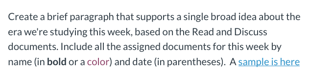


 All the books I’ve used, including works by